Bitwarden UI Refresh
I used LastPass until they decided to make their free plan not work across devices. While I think a password manager is crucial to security, the cost of storing a few KB isn’t worth the price. Now I use Bitwarden as my password manager.
Apart from being able to see how my passwords are actually being stored, Bitwarden’s Open Source codebase also has the advantage of community improvement (aka free labour 😉). I am now officially a victim of this trap.
Bitwarden’s desktop UI is probably one of its greatest weaknesses. At the time of writing, their website looks pretty good in my opinion:
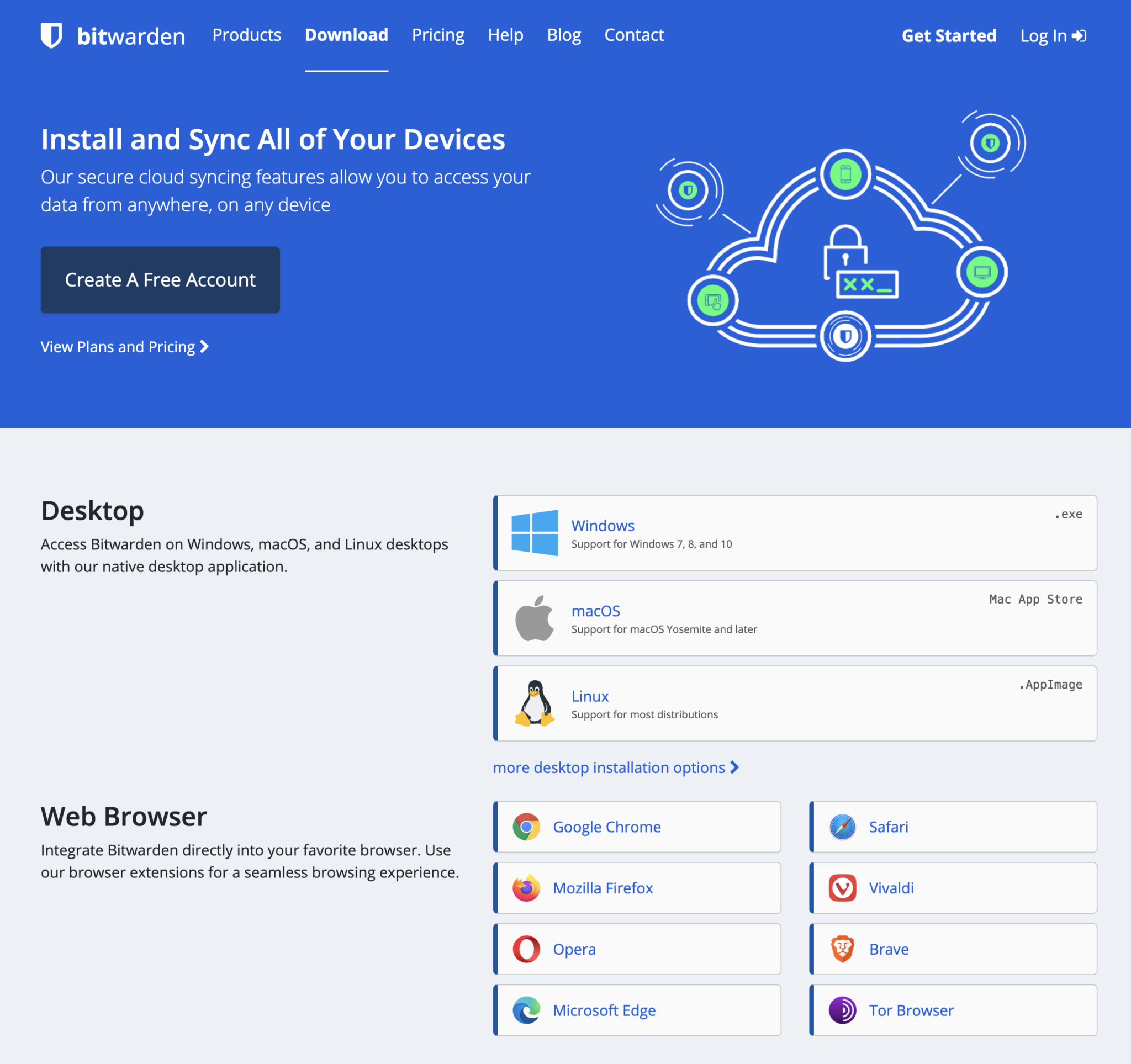
Bitwarden website
But, once you get past their landing page, things fall apart quickly.
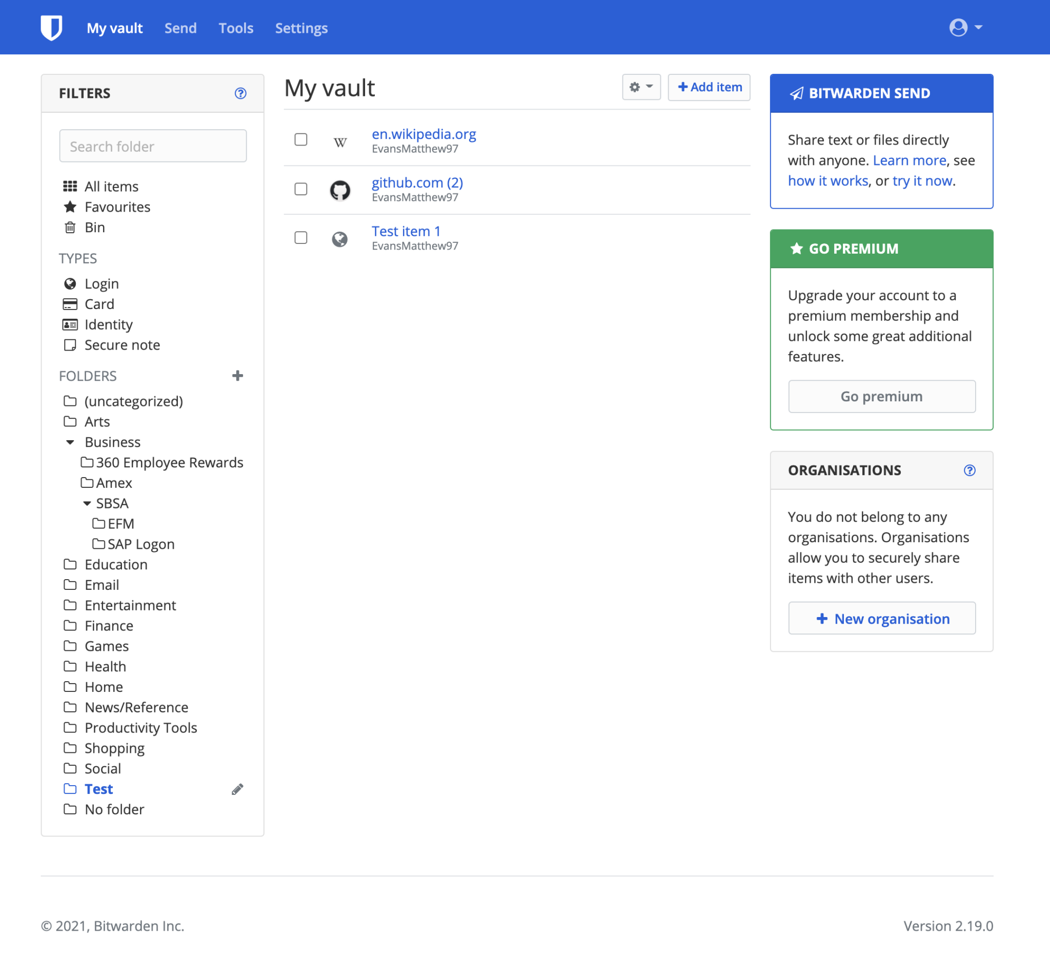
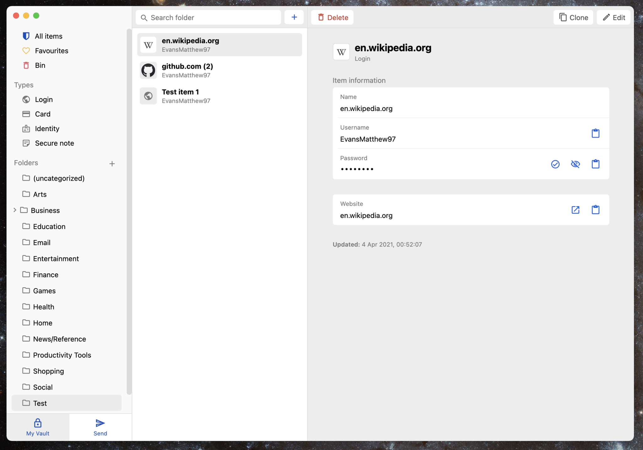
This same early 2010s Bootstrap-y look follows in all of their products, including the apps. My focus fell onto the desktop app, which I use the most for my work:
Bitwarden desktop (light theme)
From a UX perspective, I think there isn’t much wrong with Bitwarden’s desktop app. It follows a structured left-to-right hierarchy, like most of Apple’s desktop apps, and, from using it day-to-day, I haven’t found many inefficiencies or inconsistencies.
Though, take this review with a pinch of salt, as I’m relatively new and definitely not a power user.
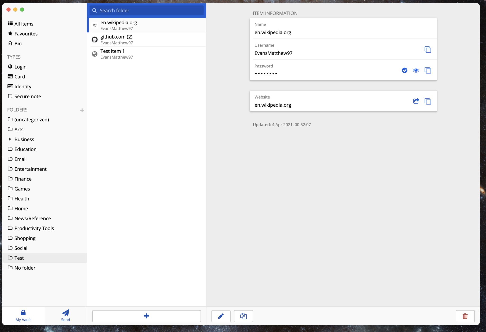
Bitwarden desktop (dark theme)
The main complaint I have, and that I’ve also seen online countless times, is their UI design. It’s dated and not very reaffirming to new users; if I am looking for somewhere to store my passwords for a long period of time, how well do I trust a company whose app looks like hasn’t been touched for 5 years?
I like to think about UI and UX like a person. UI is their outward appearance, and the UX is their personality. A person can be well-mannered, organised, hard working, funny and charismatic, but if they haven’t showered in a year nobody is going to want to be near them. In a similar sense, Bitwarden is actually pretty awesome, but off-putting to new users because it looks like it isn’t going to work very well.
The refresh
Note that this is a refresh, not a redesign. There isn’t much to be done in terms of UX, so most of the changes are relatively small. But, surprisingly, such small changes can have quite a remarkable impact when combined.
I worked with Bitwarden contributor vermotr who had a similar vision for the redesign. The refresh focuses on a few primary aspects: hierarchy, fonts, colours, spacing, iconography and depth.
The goal of the refresh isn’t to reinvent the wheel or make anything look hyper fancy. It’s to bring a bit of life to the existing app.

Inspiration
The design is inspired by Artem Nosenko’s work on Dribbble . While undoubtedly beautiful, and far more attractive than Bitwarden’s existing design, I do have a few minor critiques.
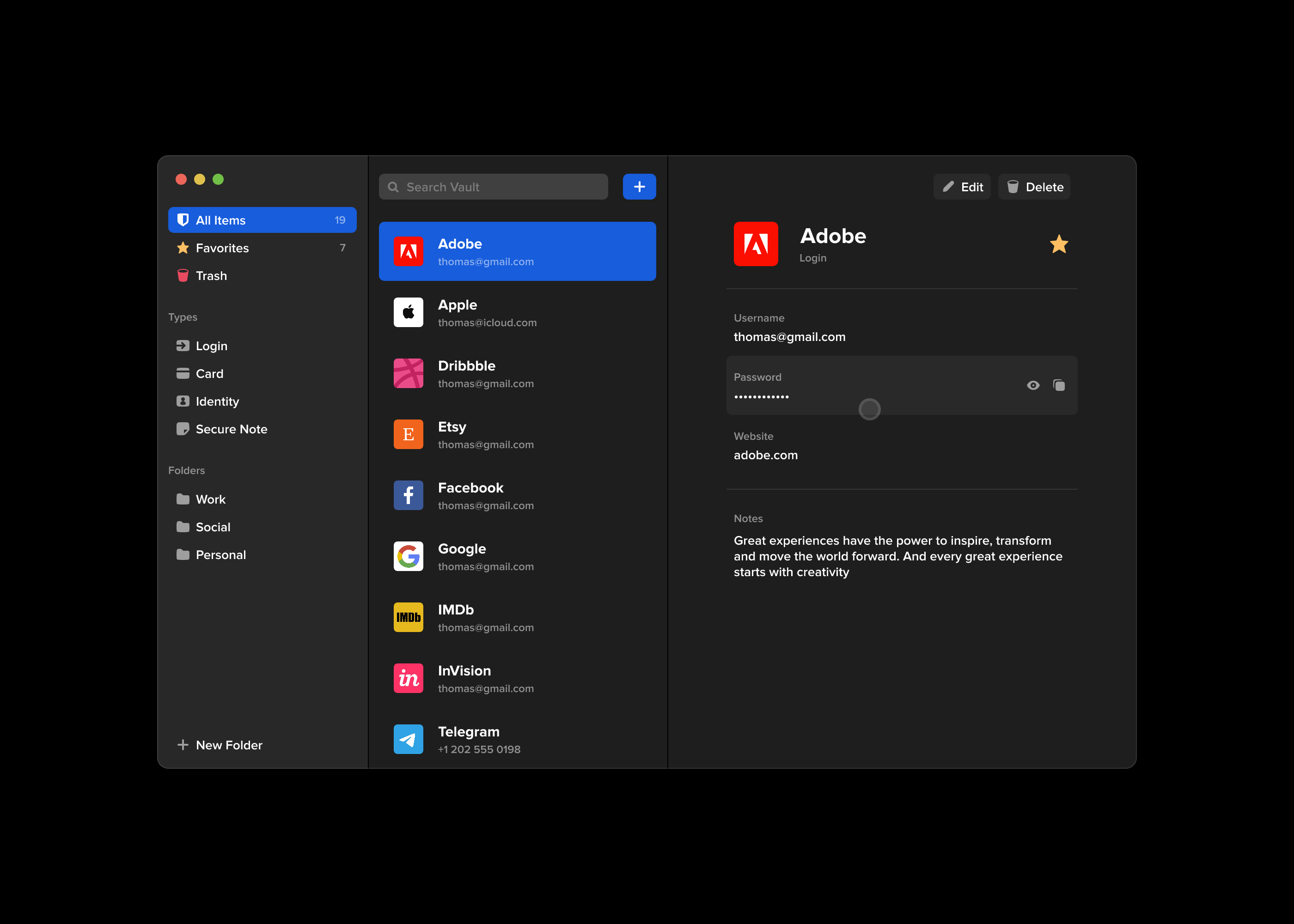
Artem’s redesign of Bitwarden
Many Dribbble artworks are designed as a piece of art rather than a realistic mock-up, which is fantastic for expanding the boundaries of what is possible in UI design, but it results in unrealistic applications designed for unknown devices for nonexistent users. Many designs have accessibility issues, copious padding between elements and a general sense of inefficiency. It is form over function.
Artem’s redesign, in my opinion, misses a few marks for a real redesign. There is too much padding between vault items, resulting in only 9 items being visible where the original app would show significantly more information. I think the additional padding is necessary, but not to this extent.
The “+ New Folder” button at the bottom left works in this design, but the Bitwarden app actually has a tab bar at the bottom which has now been completely removed in the design.

And there are actually two types of folder structures in the design: folders and collections. Collections are a premium feature used by organisations. Each of these have an add button in the current design. The single button wouldn’t work for both of these.
Artem’s design also leaves out the “clone” button for items and positions the delete button to the far-right. Typically I would expect the most important/most-used buttons to be positioned at the right. In my design the buttons are positioned with the clone and edit buttons to the right.
Changes
I changed the font from Open Sans to the default system font. It uses system-ui (we’re using Electron so cross-browser compatibility isn’t an issue) with a fallback on Helvetica Neue, Arial and sans-serif. Open Sans isn’t a particularly bad choice of font, but it doesn’t fit within the system user interface as a desktop application.


Fonts were changed from FontAwesome to Material Icons. FontAwesome 5 Free is a bit limiting. For example, the free set doesn’t include all outlined icons. In my opinion, FontAwesome is like the Calibri of icon sets. It’s not bad, it’s definitely legible, but it’s somehow made worse because it’s the default. It also has a feel of being a website font rather than an app font.
Padding was added between the vault list items to give them some breathing room, and the name of each vault item was made bold to give it some hierarchy. The items’ icons have been given a background a shade darker than the list background for a more consistent layout. This way, icons of irregular shape don’t make the design feel inconsistent.
The vault items themselves now show their name at the top of the view with their icon and type. This reaffirms to the user that they are in fact editing the correct item, rather than relying on the small bar of colour next to the list item, or the small text field’s contents under the item information section.


Some small changes
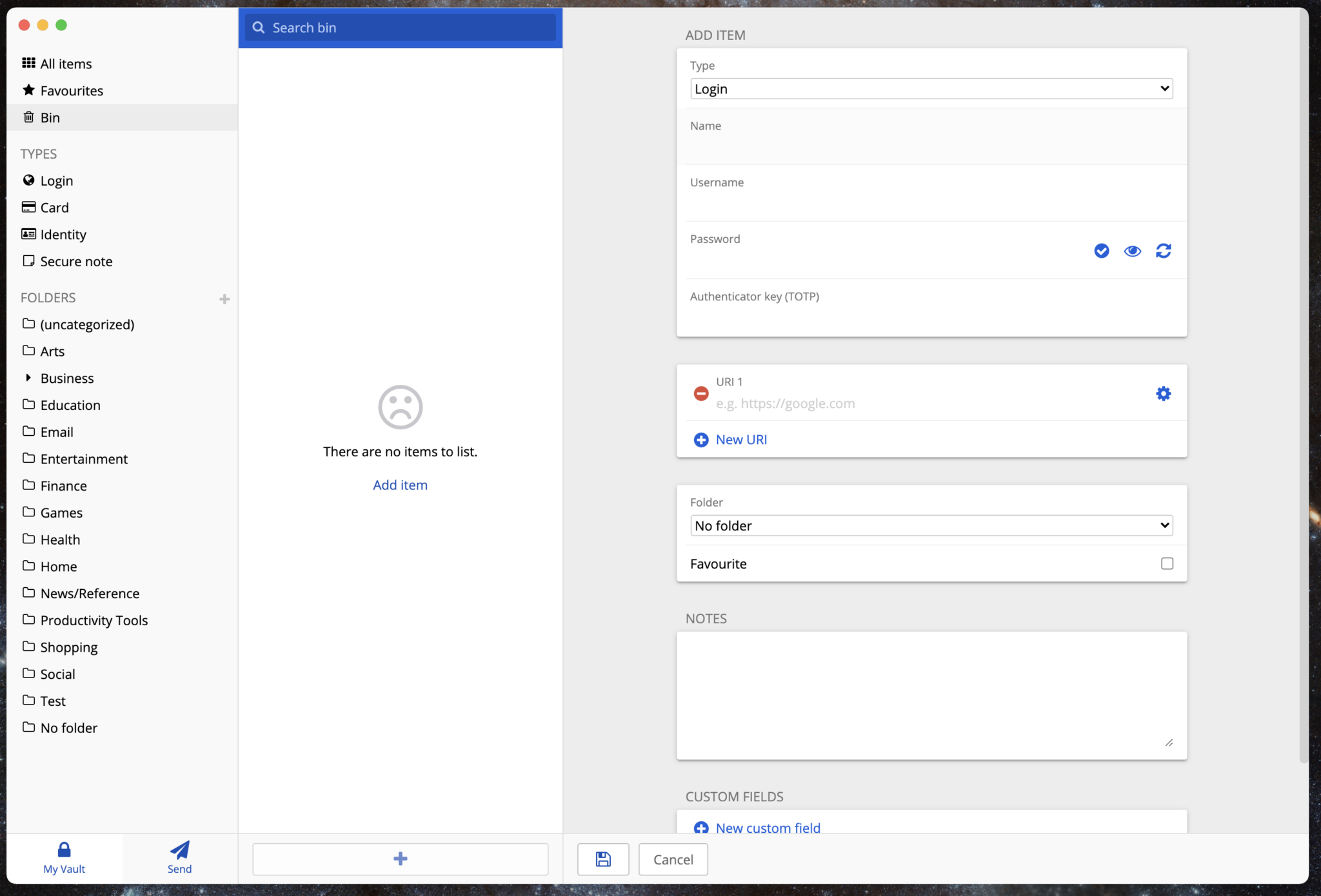
There are no items to list in the bin. Do you want to add one? You might think the “Add Item” button would let you choose an existing item to add to the bin. Instead, it lets you create a brand new password that will be added straight to the trash. Why?
In my changes I simply removed the link for the bin page
I think the next step forward with removing the link would be to add more information on how to add items to the bin. Maybe a small animation or diagram demonstrating where the delete button is on items.